This morning I held a presentation about information visualization at the Headstart social media community. The slides of the presentation are embedded above and present an overview of current trends in information visualization. In particular, I focus on how information visualization expands beyond personal devices and displays (e.g. phones and laptops) into objects, rooms, architecture and public spaces.
Starting out from traditional screen-based visualizations such as newsmap.jp, Gareth Lloyd’s A history of the world in 100 seconds, and Jonathan Harris and Sep Kamvar’s brilliant we feel fine, i move on to discuss how visualizations are increasingly distributed into physical spaces, e.g. the Maeve installation for the Venice Biennale, into objects, e.g. the Ambient Orb, onto objects, e.g. the Mejlby Stone, and finally integrated into or projected onto architecture, such as the Danish Pavilion for the 2010 Expo in Shanghai and the participative Climate Wall installation.
The talk was recorded and you can view it below. Be warned, although the slides are in English, the talk is in Danish.
This Thursday I am giving a talk on the topic of information visualization at the Headstart Network, a new and social media community. As I’m browsing through old presentations and looking at web resources, the video Journalism in the Age of Data really stands out. I’ve embedded the video below, but if you’re interested in this topic, do yourself the favour of visiting Stanford’s dedicated website. It provides heaps of additional information – links, bios, background data etc. – that supplements the video perfectly.
Being able to travel the world and meet like-minded peers is one of the great benefits of working as a researcher. At the moment, I’m in Australia to present my work at two conferences, the Participatory Design Conference (PDC) in Sydney and the OZCHI Conference in Brisbane.
Today, I am presenting my research on the challenges of working with participation as a central driver in large-scale public projects. I take my offset in the ongoing Mediaspace project in Aarhus, which is the development of a new shared building for the municipal library and citizens service department. The field of participatory design has traditionally addressed the development of interactive systems on a relatively small scale, so the Mediaspace project holds a number of interesting findings for this research field. This concerns both the variety of stakeholders in the project, the new methods and technologies that have been developed in the project in order to involve and engage people in the development of the new library, and the ways in which new technologies transforms the role of the library in society.
A couple of videos from Dentsu London and BERG that explore a variety of ways in which information could be embedded into our physical environment. I like the way in which the videos envision these systems as everyday phenomena rather than something spectacular, which is often the case in this type of presentation. After all, as these systems and displays become ubiquitous, they will inevitably become mundane occurences.
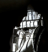
A couple of intriguing sculptural projects that I have stumbled upon recently:
Kinetic Sculpture is designed by Art+Com for the BMW Museum and is intended as “… a metaphorical translation of the process of form-finding in art and design. 714 metal spheres, hanging from thin steel wires attached to individually-controlled stepper motors and covering the area of six square meters, animate a seven minute long mechatronic narrative. In the beginning, moving chaotically, then evolving to several competing forms that eventually resolve to the finished object, the kinetic sculpture creates an artistic visualisation of the process of form-finding in different variations.”
“Augmented Sculpture” by design agencies Grosse8 and Lichtfront. The installation is a 2,5m tall wooden sculpture augmented with projections in sync with an audio track.
The iPad relies heavily on the metaphors of books and bookshelves when users organize and read novels. Books are displayed on shelves, and you turn pages by dragging them as you would a physical page. Although the implementation is very smooth (and really, who would expect anything less from Apple), I am at a loss to understand why the iPad, intended to carve out a brand new category of interactive devices, should employ such anachronistic forms of interaction. Imagine having to navigate your tunes by first leafing through animated stacks of vinyl records, dragging them to a turn-table, putting down the stylus on the first track to start playback and then subsequently dragging the stylus with your finger to wide grooves in the rendered vinyl to change tracks; b-sides would require you to start over. I’m sure that it could be implemented with silky-smooth visual effects (especially by Apple), but would you want this to be the default mode of interaction? With the caveat that I have not handled the iPad myself, I am quite certain that I would quickly opt for alternative ways of browsing and consuming e-books than the one presented at the iPad launch event. Perhaps the functions are implemented primarily in order to demonstrate to the masses that the iPad is also an e-reader? Lessening the shock of the new by applying a varnish of something familar?
Anyways, I find the two concepts outlined below – Mag+ and Courier – much more interesting when it comes to taking the opportunity to rethink how one might use a tablet in lieu of a magazine and notebook, given the capabilities the platform offers. It is not hard to imagine apps designed for the iPad that ‘borrow’ traits from these concepts in the near future, of course, but it is curious that Apple’s own proposal for reading books is so grounded in the shelves-books-pages metaphor.
The Bonnier Mag+ – a well-conceived take on how and why magazine content can be presented and consumed by use of tablets. Emphasizes not only the immediate interaction with the device, but also the way in which magazines have a place in our surroundings.
The Microsoft Courier – an endless notebook. Captures salient aspects of browsing, collecting and remixing snippets of information as an ongoing process.
With the internet overflowing with mostly similar takes on the iPad, I find these two pieces worth a read for their analysis of the reception of the iPad and how it may, through what is broadly perceived as defects or missing features, usher a change in the perception of ‘computing as usual’.
“I’m often saddened by the infantilising effect of high technology on adults. From being in control of their world, they’re thrust back to a childish, mediaeval world in which gremlins appear to torment them and disappear at will and against which magic, spells, and the local witch doctor are their only refuges…
What you’re seeing in the industry’s reaction to the iPad is nothing less than future shock.
The tech industry will be in paroxysms of future shock for some time to come. Many will cling to their January-26th notions of what it takes to get “real work” done; cling to the idea that the computer-based part of it is the “real work”.
It’s not. The Real Work is not formatting the margins, installing the printer driver, uploading the document, finishing the PowerPoint slides, running the software update or reinstalling the OS.”
“… the iPad’s multi-tasking is more than just speed. It’s a brand new user interface bringing in a new a new workflow. Something that’s simple, logical, focussed, and human. It’s multi-tasking dictated by end goals. What are you trying to achieve on this device? The iWork applications exhibit completeness within the user interface, including the media browser, file manager, and I’m sure it can send those documents as attachments via email as well.”
By peepholes, we refer to aspects of interactive artifacts and environments that utilize the tension between what is hidden and what is revealed to foster engagement. As a foundation for discussing the qualities of peepholes, we outline a pragmatist perspective on engagement in the paper. This perspective emphasizes the reciprocal relation between people, technology, and environment. From this perspective, we then explore the concept of peepholes as an example of a concrete means of engagement on the basis of a number of interactive installations, including two of our own design cases.
Here are the slides from yesterdays presentation of the paper:
Two weeks ago, I gave a talk on Experience in Interaction Design at an information and media studies research seminar. The talk sketches out the various ways in which the concept of experience is approached in interaction design. In particular, i emphasize the pragmatist perspective on experience that i build upon in my own work. This is followed by a discussion on the challenges and potentials of working with experiential aspects in real-life design projects, e.g. Aarhus by Light, Climate on the Wall and Warsaw MoMA.
I have been trying out alternatives to Powerpoint as a presentation tool, and I stumbled upon the magnificent and elegant Prezi. The embedded presentation above should give you the gist of things: Prezi basically gives you an infinite canvas on which you structure your content. You can then draw out paths on the canvas when building presentations and zoom through these when giving a talk. Do try out the full-screen option!
I’m happy to say that my PhD defense went very well, and that I am now officially entering my post-doctoral life. The defense was recorded, and I’m looking into a neat way of combining the video stream with my slides and manuscript. Also, I’m adding the finishing touches to the dissertation, which I will make available alongside the statement from the committee.
So, what’s next?
Although the final PhD writing sprint dragged me away from the various research projects that I was involved in, I have rapidly been finding myself re-involved. I’m in a research position that spans the rest of the year, so this fall I will be working on the Digital Urban Living project, as well as teaching two classes, Knowledge Sharing and Organizational Learning and Introduction to Interaction Design.